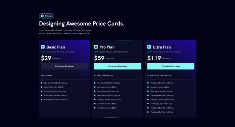
Here is a simple CSS snippet to add a cool animated border effect to your websites. This can be used on any container that’s acting as a card. For this tutorial we are adding it to the pricing card we want to highlight in pricing tables.
PS. This article is meant to be worked on along with the video tutorial below. Make sure to check it our, follow along, and use the code snippet as shown in the video.
Step 1: Add the CSS
:root{
  --ab-border-size: 2px;
  --ab-radius: 12px;

  --ab-border-color: #57FBF5; /* animated border color */
  --ab-bg: #0C0C28;           /* card background color */
  --ab-speed: 10s;
}

/* CARD */
.animated-border{
  position: relative;
  border-radius: var(--ab-radius);
  overflow: hidden;
  background: transparent;
}

/* rotating border bar */
.animated-border::before{
  content: "";
  position: absolute;
  left: 50%;
  top: 50%;
  width: 160px;
  height: 180%;
  transform: translate(-50%, -50%) rotate(0deg);

  background: linear-gradient(
    90deg,
    transparent,
    var(--ab-border-color),
    var(--ab-border-color),
    transparent
  );

  animation: ab-rotate var(--ab-speed) linear infinite;
  pointer-events: none;
}

/* card background + border mask */
.animated-border::after{
  content: "";
  position: absolute;
  inset: var(--ab-border-size);
  border-radius: calc(var(--ab-radius) - var(--ab-border-size));
  background: var(--ab-bg);
  pointer-events: none;
}

/* content above */
.animated-border > *{
  position: relative;
  z-index: 1;
}

/* animation */
@keyframes ab-rotate{
  from { transform: translate(-50%, -50%) rotate(0deg); }
  to   { transform: translate(-50%, -50%) rotate(360deg); }
}
Step 2: Add Class To Container
We’ll use Elementor for this example but the same applies to other page builders. Add the class ‘animated-border’ to the container wrapping your card. This can be a price card or any container/block acting as a card.
animated-borderStep 3: Set Values In the CSS Variables
At the top of the CSS snippet, there are a few variables. Adjust the border width and color, border radius, card background color, and animation speed.
Step 4: Watch the Video Tutorial
To get the most out if this effect, check out the video below.

