We’ve all been there. You land on a site featured on Awwwards.com and immediately think:
“I want to build something like this.”
The micro-interactions, the animations, the bold typography — it’s pure visual candy for any web designer. And while there’s nothing wrong with chasing those pixel-perfect moments, it’s worth asking the real question:
Do these award-winning websites actually perform? Or are they just beautiful distractions?
Let’s explore the difference between ultra-creative, award-winning designs and practical, conversion-focused websites, and figure out which one truly helps you and your clients succeed.
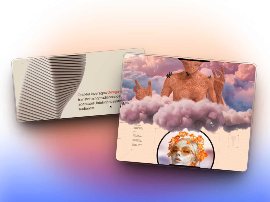
The Art of Award-Winning Websites
Award-winning sites are usually high-concept masterpieces. They’re interactive, immersive, and undeniably beautiful. You’ll often find:
- Custom animations and scroll effects
- Creative navigation experiences
- Striking visuals that grab attention
- Unique layouts that break convention
These sites are a joy to explore. They show off the talent of the designer and developer behind them. And let’s be honest, they’re inspiring as heck.
But here’s the catch…
What’s the site actually for?
Too often, these high-design experiences suffer from:
- Long load times
- Confusing navigation
- Poor readability
- Vague messaging
You might scroll for 10 seconds before realizing you have no idea what the site is about. And if you’re designing for a business that needs leads, sales, or user action, that’s a problem.
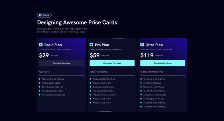
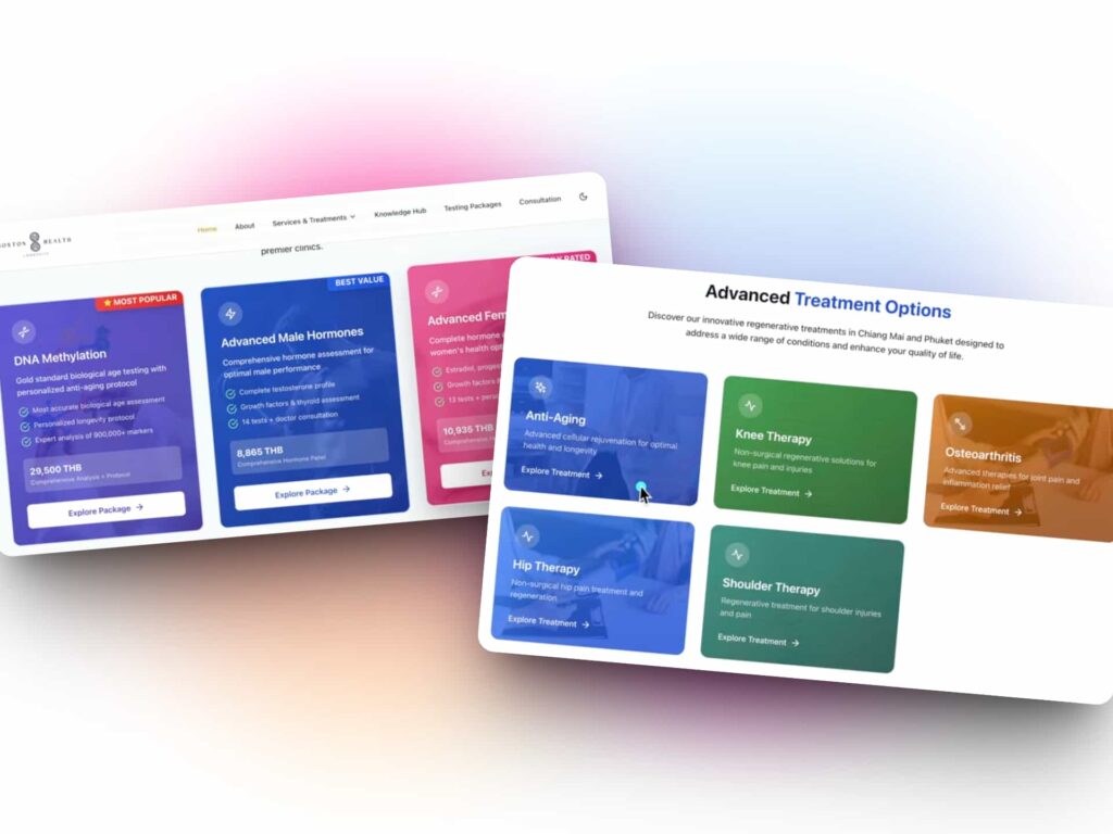
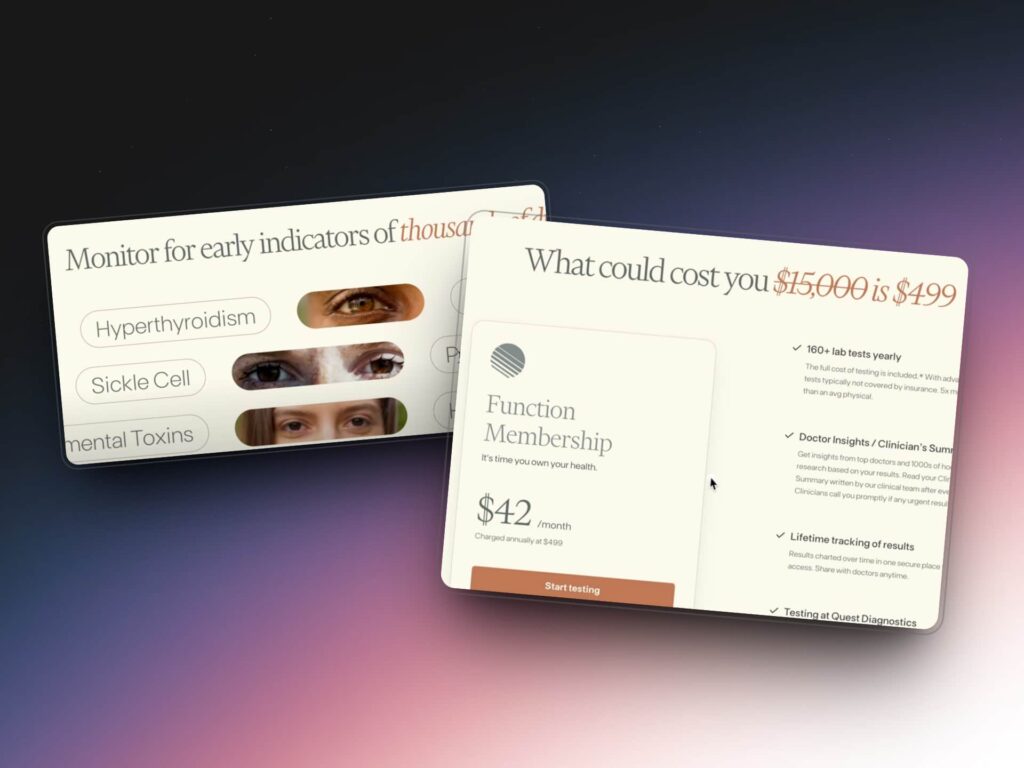
The Power of Practical Web Design
On the flip side, practical websites aren’t usually featured on design showcases, but they quietly do their job incredibly well.
These sites focus on:
- Speed and performance
- Easy navigation
- Clear messaging
- Strong content hierarchy
- Straightforward calls-to-action
They’re designed for usability, not for awards. And while they may not have fancy animations or unconventional layouts, they still deliver excellent results for most businesses.
Why practical wins most of the time:
- They convert better
- They’re easier to maintain
- Clients understand them
- Users don’t get lost
At the end of the day, a website’s primary job is to communicate clearly, guide users, and help achieve specific goals.
Finding the Balance
Here’s the good news. You don’t have to choose between the two. There’s a sweet spot between artistic expression and practical design.
Some of the best websites in the world:
- Use creative visuals with purpose
- Keep performance in mind
- Focus on storytelling and usability
- Blend aesthetics with clarity
You can push your creativity, experiment with layout and animation, and still design something functional and fast.
When to Go Full Art Mode
There’s a time and place for ultra-creative, award-winning websites. They’re a perfect fit for:
- Portfolio websites
- Brand storytelling
- Creative agencies
- Digital campaigns or microsites
- Experiential product launches
These sites are about experience over efficiency. They’re not built for everyone, but they are built to impress.
When to Keep It Simple
If you’re working with:
- Small to medium businesses
- Online coaches or consultants
- Local service providers
- Startups with tight budgets
Your best bet is a practical design that gets the job done. Fast-loading, content-forward, and easy to update will almost always outperform a flashy design with usability issues.
Remember: a clean, strategic layout is still good design, even if it doesn’t get featured on design galleries.
Final Thoughts: Design With Purpose
Every web project should start with one question:
What is this site supposed to do?
If the goal is to convert users, sell a product, or share important information, don’t get caught up trying to win awards. Keep it clear. Keep it functional. And if you want to flex your creative muscles, carve out time to build your own projects or experiment in your portfolio.
Push yourself creatively. Serve your clients practically.
That’s the balance that makes you a confident, high-value designer.
📺 Want to see the full walkthrough? Watch the full tutorial below!