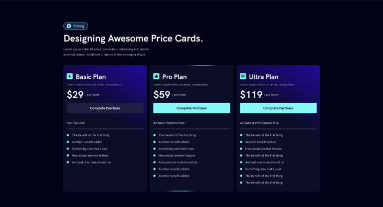
We are going to create the effect on the following layouts:
Step #1: Create The Section
- Add the section and then add 3 blocks inside a container for the cards and set up flex controls for a row layout
- Label the 3 blocks ‘Cards’ (optional)
Step #2: Create The Cards
- Inside the blocks called ‘Cards’ give a class ‘card’
- Add 1-3px padding – The padding will act as the border width
- Set z-index to 0
- Set overflow to hidden
- Set position to relative
- Style your card’s border radius and background color. Note, the background color will also be the border color when not hovered on.
- Set background color (Note, the background color will be the color of the card border)
Step #3: Create The Inner Block For Content
- Add a new block inside your Card block
- Label the inner block as ‘Inner’ (optional)
- Give the ‘Inner’ block a class name ‘inner’
- Add your content inside the ‘Inner’ block and style the block with flex settings including your inner padding and gaps.
- Set border radius (must be the same as border-radius set inside the Card block)
- Set background color to .8 opacity
- Set background hover color to .6 opacity – You can adjust the opacity to lighten or darken your hover effect
Step #4: Create The Effect Elements
- Add 2 more blocks inside your Card block
- Label the first block ‘Blob’ (Optional)
- Label the second block ‘Fake Blob’ (Optional)
- Your block structure should show 3 blocks stacked inside your ‘Card’ block in the order – ‘Inner’ > ‘Blob’ > ‘Fake Blob’ – See image above
- Give the ‘Blob’ block a class ‘blob’
- Give the ‘Fake Blob’ block a class ‘fakeblob’
- In both the ‘Blob’ and ‘Fake Blob’ blocks, set the position to absolute and the border radius to 50% all around
- In the ‘Blob’ block, choose your hover color by setting the background color
Step #5: Add the CSS
Add the following CSS code snippet to each of the card blocks:
/* css goes in .card */

%root% {
    --blob-size:250px;
}

%root% .inner{
    backdrop-filter: blur(80px);
    height: 100%;
}

%root% .blob{
    width: var(--blob-size);
    height: 80%;
    left: calc(50% - calc(var(--blob-size)/2));
    filter: blur(40px);
    z-index: -1;
    opacity: 0;
    transition: opacity 300ms 300ms linear;

}

%root% .fakeblob {
  visibility: hidden;
  z-index: -1;
  height: 100%;
}
Step #6: Add the JavaScript
You can add the JS code in your code manager plugin, if you use one. You may also simply add a code widget on that page itself and add the code there.
Add the following CSS code snippet to each of the card blocks:
<script type="text/javascript">

    const cards = document.querySelectorAll(".card");


window.addEventListener("mousemove", (ev) => {

  cards.forEach((e) => {
    const blob = e.querySelector(".blob");
    const fblob = e.querySelector(".fakeblob");
    const rec = fblob.getBoundingClientRect();


    blob.animate(
      [
        {
          transform: `translate(${
            (ev.clientX - rec.left) - (rec.width / 2)
          }px,${(ev.clientY - rec.top) - (rec.height / 2)}px)`
        }
      ],
      {
        duration: 300,
        fill: "forwards"
      }
    );

    blob.style.opacity = "1";

  });

});


</script>
Quick Tips
- To change the color of the glow effect, change the background color of the blob block
- To make the effect color lighter, increase the opacity of the hover color of the background of the inner block.
- To make the effect color brighter, decrease the opacity of the hover color of the background of the inner block.
- To add a border, adjust the padding of the card block.
Here is a YouTube video for a guided tutorial:


