Have you ever wanted to create complex layouts using Elementor? Elementor’s new grid features allow us to easily create beautiful, complex layouts. Now we can avoid adding unnecessary containers/columns while saving time on designing layouts by using Elementor grids and a little bit of CSS.
What are Elementor Grids?

Elementor grids is a new feature that is based on the concept of CSS Grids. It allows us to align and organize items in a grid layout. The Flexbox feature in Elementor is essential to use Elementor grids.
A grid has cells in it, and we can place anything in those cells, from single elements like titles, images and widgets to entire containers which can have more elements in them.
What are the Benefits of using Elementor Grid Containers?
Grids are very useful in a lot of situations. Here are a few:
- We can minimise the use of containers/columns if we use grids.
- Better for DOM structure (minimal nesting) and hence performance
- Create complex layouts without having to change the structure
- Organise items according to our needs. This is very helpful for tablet and mobile versions
If you want learn how to set up Elementor Grids Container, check out our article: https://lytboxacademy.com/how-to-use-elementor-grid-containers/
Get the free Advanced Elementor Grids Container Template
We have created a template that has 10+ Grid layouts that you can use on your web design projects to create incredible layouts. Just provide us with an email below where we can send the template to:
Steps to import and use the template:
- Once you receive the email, download the JSON file on your computer.
- Go to your WordPress dashboard, Elementor Templates > Theme Builder and click on the Import Templates button.
- Select the file from your computer and click on Import Now.
- The template has now been stored in your theme builder. You can access it, edit it and even import it into your pages to use it as you see fit.
The Elementor Grid Layouts in the Template Explained
We have 12 grid layouts in the template. We have only used CSS on the grid cells that span more than one cell. The CSS is added to the widget’s custom CSS tab under the Advanced tab since we are using Selector.

The number of grid columns and rows is determined by the maximum number of single-cell grid items that are present in each row or column. This helps us maintain design consistency.
Here is a YouTube video that explains the Templates in detail:
Let us discuss each one of them below:
Grid-1 Layout and CSS

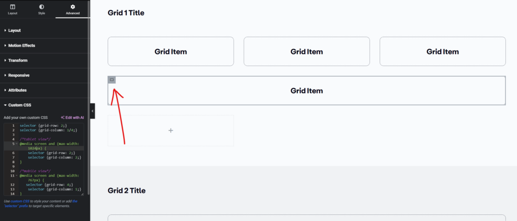
CSS for the item spanned across three column cells:
selector {grid-row: 2;}
selector {grid-column: 1/4;}

/*tablet view*/
@media screen and (max-width: 1024px) {
    selector {grid-row: 2;}
    selector {grid-column: 2;}
}

/*mobile view*/
@media screen and (max-width: 767px) {
   selector {grid-row: 4;}
    selector {grid-column: 1;}
}
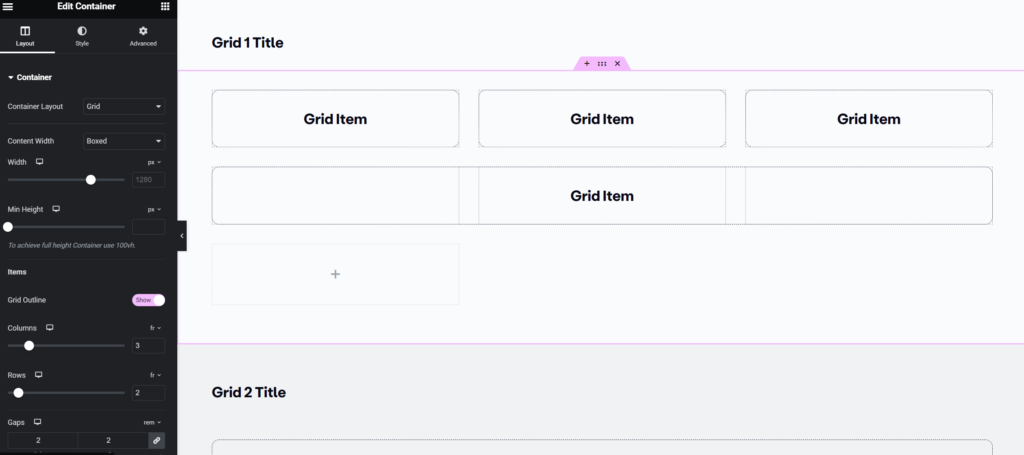
As we see, this grid has three single-cell grid items horizontally, so we will use three grid columns. And we only need two rows so we will use two Grid rows.
Steps to build it:
- First, add a Grid section and set columns to 3 and rows to 2.
- Add 4 containers, style them up and fill in the content.
- Select the fourth container, add the CSS to it and edit the grid-row and grid-column values.
- Change the values as needed in tablet and mobile versions
Understanding the CSS
For the grid items where the CSS is added, we need to specify how many cells we want the item to span. The “grid-row” property determines how many row cells the element will span and the “grid-column” property determines how many column cells the element will span.
The default behavior of the item is to span one single cell only. Hence if we set the grid-row value to 2, the item will only span through one row cell. But if we want the item to span more than one cell, we need to specify the cell it starts from and then the cell before which the item will stop spaning. For example, in the above Grid-1 layout, we have set the “grid-column” value to 1/4. This means the item will start from cell 1 and span until the start of cell 4. Hence it spans 3 cells, cell 1, cell 2 and cell 3.
Grid-2 Layout and CSS

selector {grid-row: 1/2;}
selector {grid-column: 1/4;}

/*tablet view*/
@media screen and (max-width: 1024px) {
    selector {grid-row: 1;}
selector {grid-column: 1;}
}

/*mobile view*/
@media screen and (max-width: 767px) {

}
In this layout, the CSS needs to be added on the 1st grid item, spanning across 3 columns. Hence, in the CSS, the grid-column properly value is 1/4.
Grid 3 Layout and CSS

selector {grid-row: 1/3;}
selector {grid-column: 1/2;}

/*tablet view*/
@media screen and (max-width: 1024px) {
    selector {grid-row: 1;}
selector {grid-column: 1;}
}

/*mobile view*/
@media screen and (max-width: 767px) {

}
In this layout, the CSS needs to be added on the 1st grid item, spanning across 2 rows. Hence, in the CSS, the grid-row properly value is 1/3.
Grid-4 Layout and CSS

selector {grid-row: 1/3;}
selector {grid-column: 2;}

/*tablet view*/
@media screen and (max-width: 1024px) {
    selector {grid-row: 3;}
selector {grid-column: 1;}
}

/*mobile view*/
@media screen and (max-width: 767px) {

}
In this layout, the CSS needs to be added on the 3rd grid item, spanning across 2 rows. Hence, in the CSS, the grid-row properly value is 1/3 and grid-column value is 2.
Grid-5 Layout and CSS

selector {grid-row: 1/3;}
selector {grid-column: 3/5;}

/*tablet view*/
@media screen and (max-width: 1024px) {
    selector {grid-row: 3;}
selector {grid-column: 1/3;}
}

/*mobile view*/
@media screen and (max-width: 767px) {
   selector {grid-row: 5;}
selector {grid-column: 1;}
}
In this layout, the CSS needs to be added on the 5th grid item, spanning across 2 rows and 2 columns. Hence, in the CSS, the grid-row properly value is 1/3. The grid-column value is 3/5 since it starts after the 2nd column and ends before the 5th column
Grid-6 Layout and CSS

selector {grid-row: 1/3;}
selector {grid-column: 1/3;}

/*tablet view*/
@media screen and (max-width: 1024px) {
    selector {grid-row: 1;}
selector {grid-column: 1/3;}
}

/*mobile view*/
@media screen and (max-width: 767px) {
   selector {grid-row: 1;}
selector {grid-column: 1;}
}
In this layout, the CSS needs to be added on the 1st grid item, spanning across 2 rows and 2 columns. Hence, in the CSS, the grid-row properly value is 1/3. The grid-column value is also 1/3 since it starts at the 1st column and ends before the 3rd column
Grid-7 Layout and CSS

selector {grid-row: 2/3;}
selector {grid-column: 1/3;}

/*tablet view*/
@media screen and (max-width: 1024px) {
    selector {grid-row: 3;}
selector {grid-column: 1;}
}

/*mobile view*/
@media screen and (max-width: 767px) {

}
In this layout, the CSS needs to be added on the 3rd grid item, spanning across 2 columns. Hence, in the CSS, the grid-column properly value is 1/3.
Grid-8 Layout and CSS

selector {grid-row: 1/2;}
selector {grid-column: 1/3;}

/*tablet view*/
@media screen and (max-width: 1024px) {
    selector {grid-row: 1;}
selector {grid-column: 1;}
}

/*mobile view*/
@media screen and (max-width: 767px) {

}
In this layout, the CSS needs to be added on the 1st grid item, spanning across 2 columns. Hence, in the CSS, the grid-column properly value is 1/3.
Grid-9 Layout and CSS

CSS for the first item:
selector {grid-row: 1/2;}
selector {grid-column: 1/3;}

/*tablet view*/
@media screen and (max-width: 1024px) {
    selector {grid-row: 1;}
selector {grid-column: 1;}
}

/*mobile view*/
@media screen and (max-width: 767px) {

}
In this layout, the 1st CSS needs to be added on the 1st grid item, spanning across 2 columns. Hence, in the CSS, the grid-column properly value is 1/3 and grid-row property is 1/2.
CSS for the last item:
selector {grid-row: 2/3;}
selector {grid-column: 3/5;}

/*tablet view*/
@media screen and (max-width: 1024px) {
    selector {grid-row: 3;}
selector {grid-column: 2;}
}

/*mobile view*/
@media screen and (max-width: 767px) {
   selector {grid-row: 6;}
selector {grid-column: 1;}
}
In this layout, the 2nd CSS needs to be added on the 6th grid item, spanning across 2 columns. Hence, in the CSS, the grid-column properly value is 3/5 and grid-row property is 2/3.
Grid-10 Layout and CSS

CSS for the third item:
selector {grid-row: 1/2;}
selector {grid-column: 3/5;}

/*tablet view*/
@media screen and (max-width: 1024px) {
    selector {grid-row: 2;}
selector {grid-column: 1;}
}

/*mobile view*/
@media screen and (max-width: 767px) {
   selector {grid-row: 3;}
selector {grid-column: 1;}
}
In this layout, the 1st CSS needs to be added on the 3rd grid item, spanning across 2 columns. Hence, in the CSS, the grid-column properly value is 3/5 and grid-row property is 1/2.
CSS for the fourth item:
selector {grid-row: 2/3;}
selector {grid-column: 1/3;}

/*tablet view*/
@media screen and (max-width: 1024px) {
    selector {grid-row: 2;}
selector {grid-column: 2;}
}

/*mobile view*/
@media screen and (max-width: 767px) {
   selector {grid-row: 4;}
selector {grid-column: 1;}
}
In this layout, the 2nd CSS needs to be added on the 4th grid item, spanning across 2 columns. Hence, in the CSS, the grid-column properly value is 1/3 and grid-row property is 2/3.
Grid-11 Layout and CSS

selector {grid-row: 1/4;}
selector {grid-column: 2;}

/*tablet view*/
@media screen and (max-width: 1024px) {
    selector {grid-row: 2;}
selector {grid-column: 2;}
}

/*mobile view*/
@media screen and (max-width: 767px) {
selector {grid-column: 1;}
}
In this layout, the CSS needs to be added on the 4th grid item, spanning across 3 rows. Hence, in the CSS, the grid-row properly value is 1/4.
Grid-12 Layout and CSS

selector {grid-row: 1/4;}

/*tablet view*/
@media screen and (max-width: 1024px) {
    selector {grid-row: 1;}
}

/*mobile view*/
@media screen and (max-width: 767px) {
    selector {grid-row: 1;}
}
In this layout, the CSS needs to be added on the 1st grid item, spanning across 3 rows. Hence, in the CSS, the grid-row properly value is 1/4. Since the item is the first item and it spans across one cell, we can skip the grid-column property altogether.


