
Have you ever wanted to build custom mobile menus which look and work way better than the default Elementor menus? Well, Elementor Popups offer an incredible solution to this problem. We can create beautiful mobile menus, completely from scratch, to improve design and user experience.
In this tutorial, we will learn how to build a mobile menu using Elementor Popups (also called an off-canvas menu).
Why should we use Elementor Popups to build better mobile menus?
The default mobile menu widget in Elementor is good for creating simple menus. However, when we need to build something which requires a custom design, the default menu fails.
To solve this, we can use “Elementor Popups” to create a custom-designed menu. We can also add elements other than just the menu, for example, adding “register” and “login” links. It also gives us the freedom of creativity to build menus the way we want, to offer better user experience and accessibility
Step 1: Plan your style and design for the menu
We need to decide on the main factors that would make the menu successful. Study your target audience, look for inspiration and decide on the design of your menu. The key factors for decision-making will be user experience, accessibility and aesthetics.
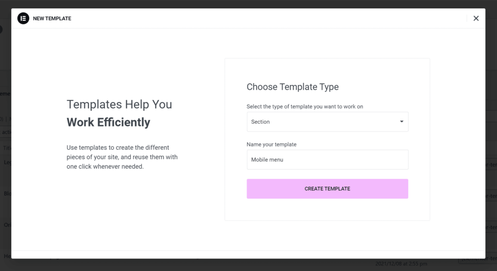
Step 2: Create the design as a template
Go to Elementor templates, and click on add new. Select “section” under the type of template, add a name to your template and click “create template“.
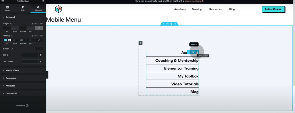
Next, design your mobile menu the way you want. While designing it, use appropriate font sizing, so it’s easy for users to understand and use. Once you are done, click on publish.
We could have designed the popup directly inside Elementor Popup, however, designing it in separate templates makes it easier to design the menu properly.
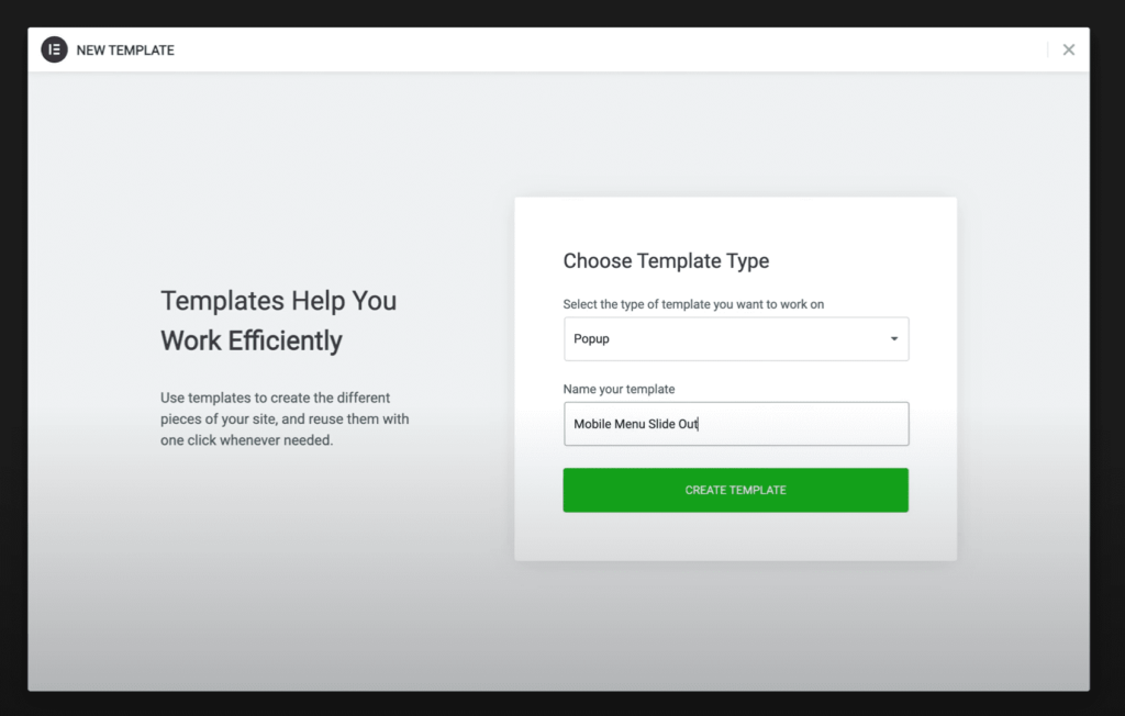
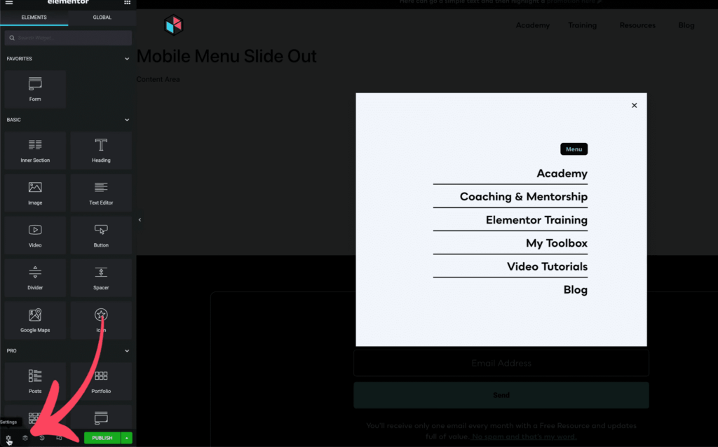
Step 3: Create the popup
Go back to the WordPress dashboard and then navigate to Elementor Popups, and click “add new“. Give your popup a name and click on “Create template“
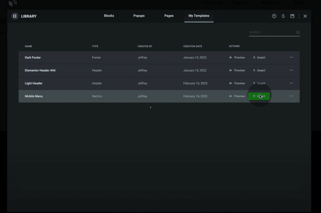
When the Elementor editor window opens, select the template from “My Templates” to insert the mobile menu template that you just created.
Step 4: Configure the popup settings
Navigate to the bottom left corner of the screen, and click on the gear icon to open “Popup settings“.
Here are the options available in the Elementor popup settings:
Width: Select the metrics in which you want to set the popup width. There are two options in general:
Pixels (px): This allows you to set the popup width in pixels
Vertical Width (vw): This allows you to set the width of the popup as a percentage of the screen width.
Height: Set this to “Fit to screen” so that the menu fills up the entire height of the screen.
Content Position: Set this to the top for a full-height popup menu.
Position: We have two options, “Horizontal” and “Vertical” Set the horizontal side to the side where you want the menu to be aligned. This would ideally be the side the menu appears from. For a full-height menu, the vertical position settings can be left as it is.
Overlay: There is overlay by default. You may keep it or remove it according to your style.
Close button: Having a close button is good practice as it makes it easier for the user to close the menu.
Entrance Animation: Set this to the side you want the menu to appear from.
Exit Animation: Set this to the side you want the menu to disappear to when it is closed.
Animation Duration(ms): Set the time the menu takes to appear.
Nothing needs to be changed in “General” settings or “Preview Template”.
Under the style tab, you can edit the style of the popup.
Popup: You can change the background colour to what you want or even add an image as the background.
Overlay: This allows you to set the overlay colour and opacity. (Pro tip: making the overlay light is a good practice while building mobile menus)
Close Button: You can set the position, color and size of the close button in this tab. Make sure the close button is clearly visible and accessible to the users.
For the Advanced tab settings, there is not much configuration needed as these settings become more relevant while building popups for newsletters, promotions, etc.
Click on the publish button to publish the popup menu that you just created. No need to add any conditions or triggers simply click “Save and close“.
Step 5: Set up the menu icon
Edit your header, add an icon for the menu and set it to only be visible on tablet and mobile. Hide the desktop menu on mobile. Next, customize the icon the way you want. In the link option for the icon, click on the custom URL option and select the dynamic link icon. Then scroll down to the popup option and select it. Once selected, click on the wrench icon or the word “Popup” and under “Popup”, type the name of the mobile menu popup you created and select it.
HOORAY! Your popup mobile menu is live. You may run tests and make necessary adjustments as you see fit.
Conclusion
The Elementor Popup feature is a good option for creating better custom-designed menus and allows us to take into consideration factors like user experience and accessibility.
If you want to include anchor links to your popup menu and want the menu to close on clicking the menu item, check out our blog on the same: https://lytboxacademy.com/auto-close-anchor-links-in-elementor-slide-out-menu/
Here is a video tutorial for a more guided tutorial: