Big news for web designers: Elementor is about to flip the script on how we build websites.
This change is more than just another feature update. It’s a complete shift in workflow that will make building sites faster, cleaner, and way more efficient. If you’ve ever felt bogged down by endless clicking through style tabs, this one’s for you.
Let’s dig into what’s coming with class-based styling and how you can get ahead of it.
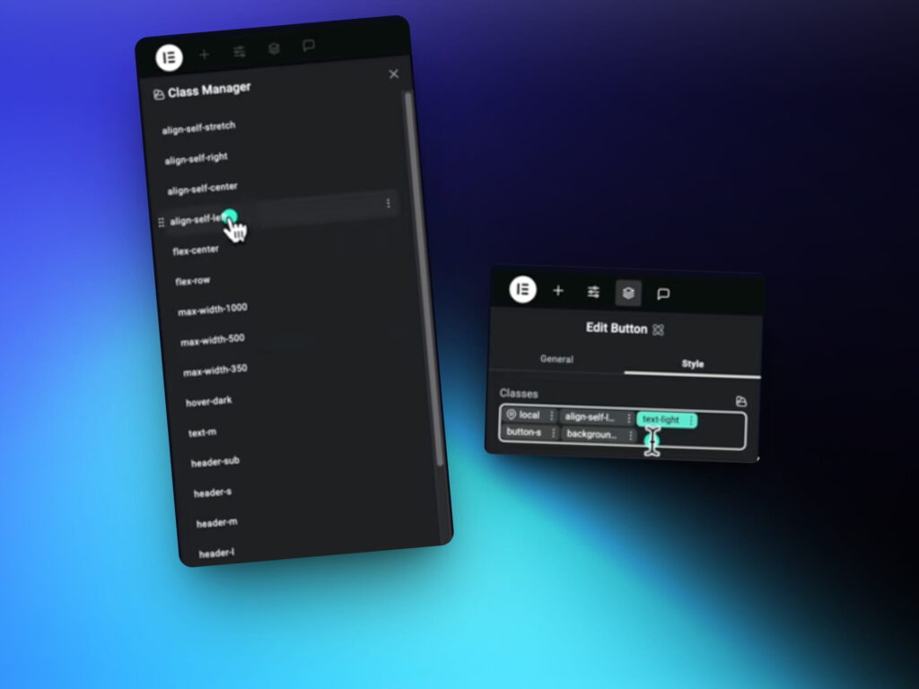
What Is Class-Based Styling?
Up until now, Elementor users have styled each element individually—adjusting font sizes, margins, colors, and padding for every single widget. It works, but it’s not scalable.
Enter: class-based styling.
This new system allows you to assign pre-designed style classes to your elements. No more setting styles manually. No more cluttered IDs. Just apply a class and move on.
Why this is a game changer:
- Apply consistent styles across your site in seconds
- Cut down on repetitive clicks and manual adjustments
- Build a clean, scalable system from the ground up
- Say goodbye to messy inline styling
The best part? You don’t need to write any CSS. It’s all handled within the new visual editor.
Build a Framework Once, Use It Forever
With class-based styling, you’re not just speeding things up—you’re creating your own design system.
Think of it like t-shirt sizes for your layout:
- section-XXL, section-L, section-M for different paddings
- gap-small, gap-medium, gap-large for consistent spacing
- header-sub, header-XXL, text-light, text-dark for typography
- flex-row, flex-center, text-align-center for layout
- card-small, icon-medium, button-large for components
You set these up once and reuse them across any project. No more reinventing the wheel every time.
Let’s See It in Action
Here’s a simple example of how class-based styling changes everything.
Traditional way:
- Add a title
- Go to the style tab
- Adjust font size, color, spacing
- Repeat for every other element
New class-based way:
- Add a title
- Apply header-XXL
- Done.
Need to add spacing? Just apply gap-medium. Want consistent button styling? Use button-large, add background-blue, and throw in text-light.
Want to center your content? Use flex-center and text-align-center.
The whole section is built with reusable classes, no custom tweaking required.
Create Your Own Style Library
To make this work, you’ll want to create a dedicated Class Builder page in your Elementor workspace. Spend some time setting up your core classes:
- Max widths like max-500, max-1000
- Padding utilities like padding-bottom-20
- Radius classes for corners
- Custom background and hover styles
- Typography settings for different devices
Once these are in place, they become your personal blueprint for every project moving forward.
Fast Layouts, Clean Code
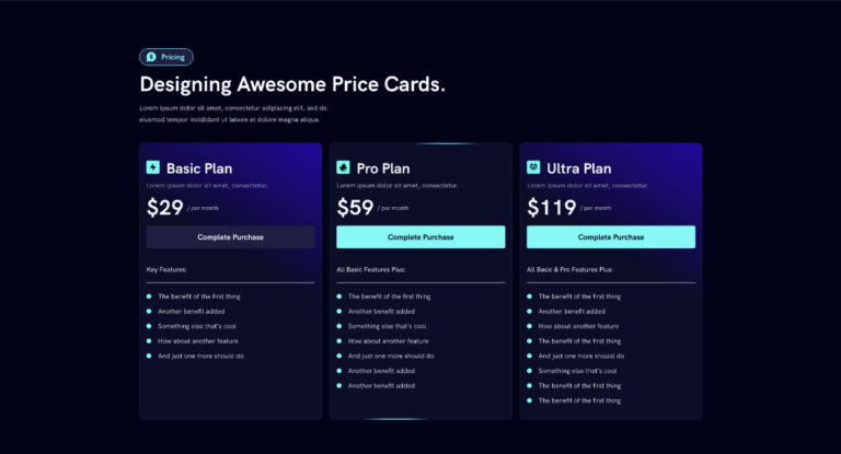
Let’s say you’re building a grid of cards. With your new framework, it’s as simple as:
- Add a container
- Apply section-large and background-light
- Use flex-row and flex-center for layout
- Drop in cards with card-medium
- Add icons (icon-medium), headers (header-large), and text (text-medium)
- Apply gaps, radii, and max widths where needed
You’ve just built a fully styled grid section without opening the style tab once. Clean, consistent, and efficient.
Get the Framework Blueprint
A complete Elementor class-based framework is being prepared to help designers build faster and smarter.
The blueprint will be ready once Elementor finalizes the v4 editor. If you want early access as soon as it’s released, make sure to sign up for the Lytbox newsletter.
Here’s what you’ll get:
- The full framework to drop into your projects
- A ready-to-use class builder
- Weekly web design tips, templates, and tutorials
📺 Want to see the full walkthrough? Watch the full tutorial below!


