If you’re new to Figma or just starting to explore design systems, welcome. You’re about to unlock a smarter way to design, and it starts with Figma variables.
I just dropped a new YouTube video walking you through how to build a variable-based design system in Figma step-by-step. But if you’re more of a reader or want a written breakdown to follow along with, this post has you covered.
What Are Figma Variables (and Why Should You Care)?
Figma Variables let you create reusable values, like colors, spacing, typography, text, and tokens that can be applied across your entire design system. Instead of manually adjusting every single instance of a color or size, you can just update the variable, and boom, everything updates automatically.
This makes your workflow faster, cleaner, and way more scalable, especially if you’re working on multiple projects or handing things off to clients or developers.
Step 1: Plan Your Design Tokens
Before you start creating anything in Figma, you need to plan your core tokens. Think of these as your foundation or frameworks. Values that won’t change often but define the personality of your design system.
Here’s what I set up in the video:
- Spacing: Sections, gaps, and padding
- Typography: All the tokens that goes into a class like text-l, text-m, text-s, etc.
- Colors: Core brand colors + neutrals
- Border radius, shadows, opacity, etc.
You don’t need 100 variables to start. Just define what you actually use.
Step 2: Create Your Variables in Figma
Now in Figma, you’ll go to the Variables panel and start setting things up. You can group variables into collections like:
- Spacing
- Typography
- Colors
- Borders
For example, I created variables like:
gap-xxs: 4px
gap-xs: 8px
gap-s: 12px
gap-m: 20px
gap-l: 40px
gap-xl: 60px
Figma lets you name these however you want, but keep it clean and following best practices like BEM naming. Think how can I make this easy to turn into a class or variable when building the site.
Step 3: Build Components That Use Variables
This is where it gets fun.
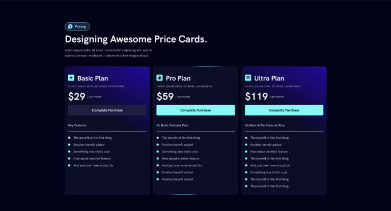
I built a button component using spacing, color, radius, and font size variables—so if I ever want to update how my buttons look, I just change the variables, and everything updates.
Use variables in the styles and inside components. Figma’s variable integration even works with auto layout and Boolean properties.
Step 4: Test and Expand
Once your core system is in place, start applying it across a full UI design. You’ll instantly see how easy it is to stay consistent, and how fast updates become.
From there, expand your system:
- Add dark mode variables
- Create size scales for responsive breakpoints
- Link text and color variables to components
It becomes a living system that you can build on over time.
Why This Matters
Design systems are not just for big teams. Even solo designers or freelancers can benefit from having a smart setup. Variables bring structure to your work and remove the mess of outdated styles and inconsistent spacing.
If you’re working in Figma and not using variables yet, now’s the time to start. It’s a game-changer for your workflow and your professionalism as a designer.
Watch the Full Tutorial
Want to see the full walkthrough in action?

