If you’re tired of the same ol’ icon box layouts and want to level up your design game inside Elementor, Bento grids might be exactly what you need.
In this tutorial, we’re turning a basic icon layout into a stylish, dynamic Bento grid. And along the way, you’ll learn how to span containers, work with columns like a pro, and even create slick 3D icons using a free tool. Let’s dive in.
What Is a Bento Grid?
Inspired by the structure of a Japanese lunchbox, Bento grids are modern layouts built with flexible, modular blocks. They feel structured, but also creative, perfect for showing off services, features, case studies, or even your portfolio.
These grids:
- Combine asymmetry and balance
- Use varied column spans to create flow
- Are fully responsive when built right
- Make your site look polished and on-trend
And yes, you can build them entirely in Elementor using Containers and Grid layouts.
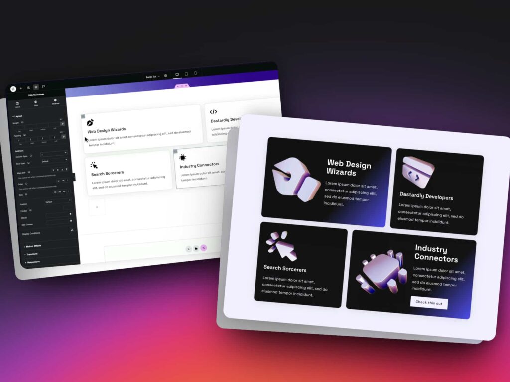
Step 1: Start with a Basic Icon Grid
To begin, we start with a simple layout: icon, heading, and paragraph.
Instead of using the standard Icon Box widget, we build each box with inner containers so we can add more, like buttons, backgrounds, and flex positioning. This gives us better control over layout and responsiveness.
Step 2: Turn Your Container into a Grid
- Select your outer container and set the layout to Grid
- Rename it something like bento-grid for clarity
- Choose how many columns (fractions) you want to work with:
- 4 = 25% per column
- 12 = 8.33% per column (more flexible)
The more columns, the more control you’ll have over span combinations.
Step 3: Use Column Spans to Build Your Layout
Each grid item should be:
- Renamed to grid-item
- Adjusted with Column Span in the Advanced tab
Examples:
- A span of 7 out of 12 = roughly 58% width
- A span of 5 out of 12 = roughly 42% width
- Make sure each row adds up to 12 or it will break the layout
This is how you get creative, asymmetric layouts while keeping structure.
Step 4: Add Style and Depth
Once your layout is working:
- Add background colors to each grid item
- Adjust text and heading styles for contrast
- Use flexbox to align content side-by-side or top-to-bottom
- Drop in buttons or CTAs for interactivity
Now your layout is functional and stylish. But we’re not done yet.
Step 5: Create Stunning 3D Icons (Free)
To replace flat icons with something cooler, head to Formia.so — a free, lightweight 3D icon builder.
Here’s what you do:
- Pick a style (e.g., holographic)
- Upload your SVG icon
- Adjust angle, lighting, and colors
- Export the graphic (PNG works fine)
- Crop and optimize before uploading to Elementor
Pro tip: Stick to the same style and angle for all icons so they look like part of the same design system.
Step 6: Make It Responsive
On Tablet and Mobile:
- Change your Bento Grid from 12 columns to 2
- Update all grid items to span 1 column (for a 2-column layout)
- Stack content vertically using flex-direction: column
- Resize your icons and text for smaller screens
You can get creative on desktop but keep it uniform on smaller devices for better UX.
Final Touches and Pro Tips
- Use gradients on grid items to create highlight areas
- Keep your layout between 1000px–1200px wide for bento-style spacing
- Use consistent padding and margin with rem units
- Set global styles in your design system for repeat use
- Geek out, this is your playground!
Want to see the full walkthrough? Watch the full tutorial below! 🎥


