Why should we optimize our headers and menus for SEO?
When we optimize our headers and menus for SEO, we can get really good results with our site links on search engines. Proper site links appearing on search helps users easily navigate to the important pages of the website.
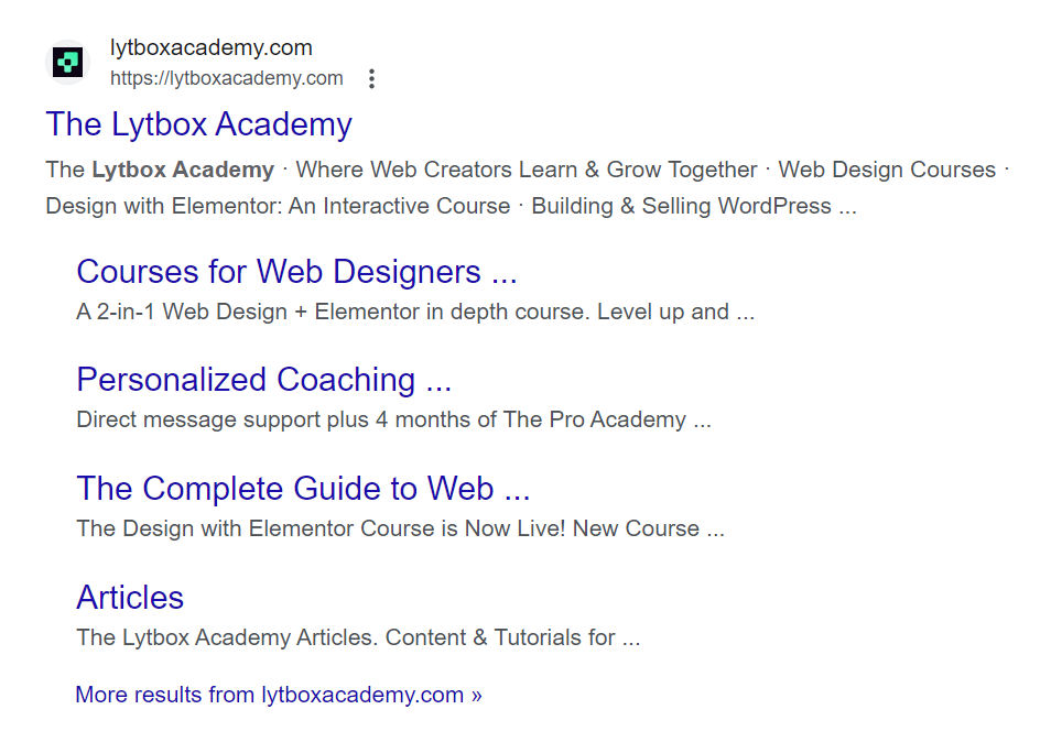
When the headers and menus are not correctly optimized, we essentially block Google and other search engines from indexing our website links properly. This results in poor search results. Following good practices can allow us to let Google and other search engines know which links we want users to see.
In this article, we are going to discuss how to best set up elementor navigations, menus, and headers to get the best SEO results. We will also discuss how to avoid some critical SEO errors.
What does Google look for when crawling menus?
When crawling a site’s header, search engines like Google generally look for certain tags, like the <header>, <nav>, <ul> and <li>. Using the appropriate tags allows search engines to read the site links properly and hence improves SEO.
The <header> tag wraps around the entire header. This tells search engines that this is the header of the site.
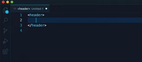

The <nav> tag wraps around the navigation menu. This lets the search engines know that the site links will be contained inside this element. <ul> denotes the list of the links and <li> denotes the links themselves.

Basic Header and Menus
For the first example, we will use a very basic header, with the site logo, and a menu. We will use Elementor’s WordPress Menu widget. This was originally called the Nav Menu widget, Elementor recently changed its name after introducing the Mega Menu.
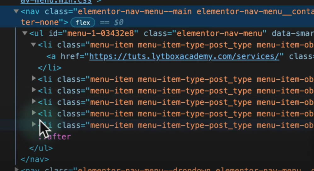
The WordPress Menu widget is the most SEO optimised widget for menus, as it renders a menu structure which is optimized for SEO.

We can see the HTML structured rendered by the WordPress Menu widget using the inspect tool. It is that the HTML code rendered is quite clean, free of unnecessary div tags, and has the proper hierarchy of tags that we discussed before (<nav>, <ul>, <li>).
All we have to do is wrap the container we are using, inside a <header> tag. To do this, select the parent container, click on Additional Options from the left panel, and select header from the HTML Tag dropdown.
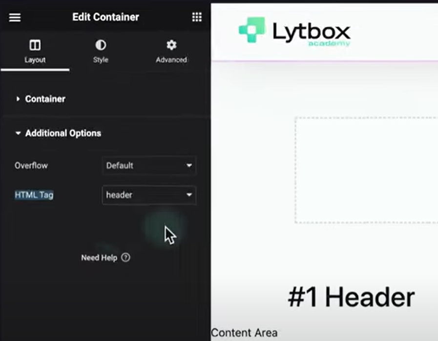
Once we hit publish/update, we can go to the front end and inspect again. This time, the <header> tag will be wrapping the entire container. Now the structure is optimized for SEO.
A Header with multiple Elements and Containers
It is quite common nowadays to have complex headers, that have several elements and containers. For example, there might be a CTA button and basic contact information above the main header.

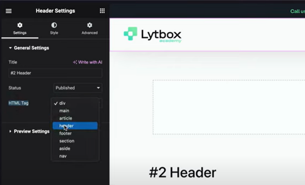
In this case, we have two containers, instead of one like the previous example. We are already using the WordPress Menu widget so the only thing to add is the <header> tag wrapping around both the containers.
Therefore, in this case, we will navigate to settings by clicking the gear icon on the bottom left corner of the Elementor Panel, and then select <header> from the HTML tag dropdown.
But why didn’t we do the same with the first example?
Good question! When we add the <header> in the settings, it adds a lot of <div> tags between the <header> and <nav> tags. This is bad for SEO, as the search engines need to crawl harder in order to read the HTML structure and traverse from <header > to <nav>.
We often have CTA buttons in headers. However, search engines don’t consider the button link to be an important site link. To fix this, we can remove the button widget, and use the menu widget itself. In this case the CTA is the Contact Page.
First, we need to go to the backend and add the Contact page link to the menu. Then, we need to click on Screen Options and enable CSS Classes by clicking on the checkbox. Now we can add a CSS class to the contact page link, and edit it using CSS to look like a button.
Let us know in the comments if you need any help with the CSS 😉

Slide Out Menus with Elementor Popup
When we use menus that are built using Elementor Popup, they are not scanned/crawled by search engines. This is because popups do not populate into the code until they are triggered and loaded, which happens for a short period of time. Hence popups are not a good option for SEO. If we check the code by inspecting the icon/button that triggers the menu, we find no <nav>, <ul> or <li> tag.
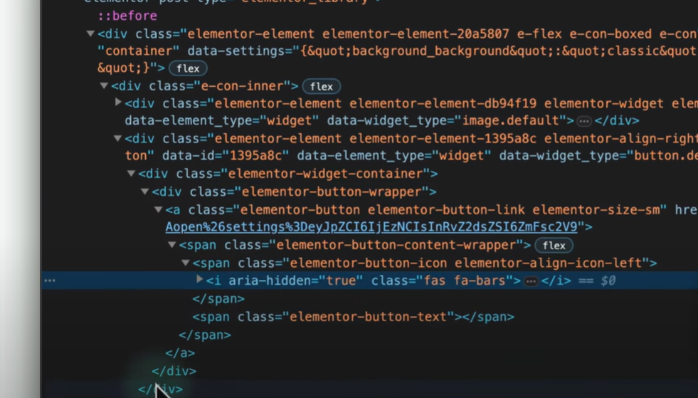
So do we need to stop using Elementor Popups for menus? Not quite!
As long as we are using the WordPress Menu widget on desktop, and wrapping it inside a <header> tag, we are good to go. Search engines like Google will crawl the desktop version of the site to index it. Hence, slide out menus using Elementor Popup should only be used for mobile and tablet.
The Mega Menu Header
Mega Menus have revolutioned menus and made them more aesthetic, at the same time, improving user experiences and ease of navigation. However, they are not good for SEO. When we use the Elementor Mega Menu, the menu items are rendered as <div> tags instead of <li>. This structure will prevent search engines to index the links as important site links.
The best way to SEO optimise a mega menu is to custom build it. This is for websites where both the mega menu and SEO are very important factors.
Conclusion
Optimising website header and menus for SEO can allow search engines like Google easily index the important site links and improve search results. The important takeaways from this article should be the HTML tag structure that constitutes for good SEO:
<header>
  <nav>
     <ul>
       <li>Menu Item 1</li>
       <li>Menu Item 2</li>
       <li>Menu Item 3</li>
     </ul>
  </nav>
</header>
Here is a youtube tutorial to better guide you through the process:
