
What is a Shrinking Sticky Header with Elementor
A shrinking sticky header using Elementor is a cool effect on a menu. Well, actually, it’s a combination of two effects. So let’s break them down to make them easier to understand.
A sticky header is an effect when you scroll a website, the menu and header stick to the top of the page. This makes it much easier for the website’s viewer to navigate around a website. And using Elementor to make a sticky header can be simple even for a newbie.
A Shrinking header is an effect when the user scrolls down the web page, and the menu items shrink, making the header smaller and taking up less space. This effect is also ideal for a better user experience as it reduces the size of a header allowing more of the webpage to show.
In this tutorial, we will make it easy and show you how to do this on your website using only Elementor and Elementor Pro to create a shrinking sticky header on scroll effect. Of course, there’s a little bit of CSS to copy and paste, but not to worry, even a beginner can follow along and build this.
Why Use a Shrinking Sticky Header on Scroll with Elementor
There’s a simple answer to this. A sticky header combined with a shrinking effect improves the usability of a website. Making a site easier to navigate which leads to a better user experience.
What You’ll Need For This Tutorial
You’ll need Elementor and Elementor Pro. Yeah, you’ll need the pro version, and I know it costs a bit, but to really use and unlock the power and potential of Elementor, the pro version is needed.
You’ll also need to understand how to build a header with Elementor. If you’d like to learn more about building a header With Elementor, I have quite a few video tutorials here.
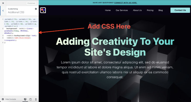
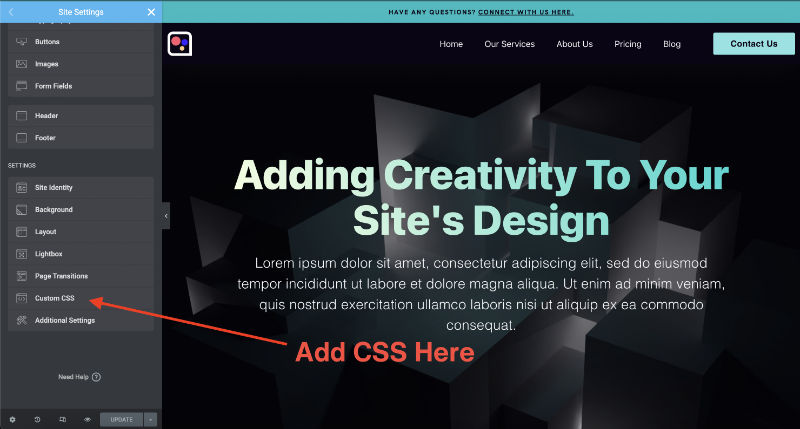
Where To Add CSS For This Tutorial
For this tutorial, we will need to add some CSS. However, it’s simple, and you don’t even need CSS knowledge. Just copy and paste, and I will show you where to edit to adjust your effects.
Add your CSS to the Customizer or in Elementor’s CSS located in Elementor Settings. See the images below.
For more information about adding CSS, you can check this out here.
How To Create a Sticky Header On Elementor
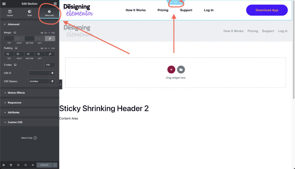
First, make sure to have your header built. Then, after your header is completed, select to edit your Section (or outer Container if you are using containers).
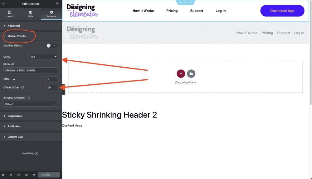
Next, navigate to the Advanced tab and select Motion Effects. Then, in the Sticky option, select Top.
Next, choose if you will have your header sticky on Desktop, Tablet, and Mobile. In the video tutorial, I show how to make your header sticky and shrink for mobile, so make sure to check it out!
And next, this part is super important, add a number value to the Effects Offset. The Effects Offset determines how far the web page needs to be scrolled for the sticky effects to kick in. What number you put here is the number of pixels the page needs to scroll. A good number is between 60-120.
How To Make Your Sticky Header Shrink On Scroll
In this next part, we’ll start to add effects to our sticky header with Elementor. We will make our logos, menus, call to action button, and overall header section shrink. Then, I’ll break down each section so you can apply only what you need.
Make the Header Section Shrink On Scroll With Elementor
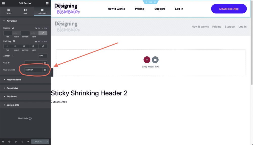
To start, we need to give a class to the section (or container) that is wrapping our header. This is a must to make sure the CSS works. Only the elements, logo, menu, and button will shrink in a single section (or container), wrapping everything.
Select to edit your Section (or Container) and navigate to the Advanced tab. Then go down to your CSS Classes and add in “shrinker”. See the image below.
Copy and paste the CSS below. Now, there’s a little bonus in this CSS. I added an option to change the color of your menu on scroll as well!
/* shrinking header section */

.shrinker {
	background: transparent;
        height: (set your header height in pixels);
	transition: all .2s linear!important;
	-webkit-transition: all .2s linear!important;
	-moz-transition: all .2s linear!important;
}

.shrinker.elementor-sticky--effects {
	background: #fff;
        height: (set your header height after shrinking in pixels)!important;
	padding-top: 2px!important;
	padding-bottom: 2px!important;
	box-shadow: 0px 6px 30px -4px rgba(0,0,0,.05);
	transition: all .2s linear!important;
	-webkit-transition: all .2s linear!important;
	-moz-transition: all .2s linear!important;
}
How to Change Your Header Background Color On Scroll with Elementor
I’ve added a bonus effect to this tutorial. We can use the CSS snippet below to change the header’s background color on scroll with Elementor. You can start with a transparent background on your header and give it a solid color on scroll. Or you can simply change the colors. I have also added an additional option for mobile so we can add an extra color for mobile header background colors.
In this first snippet where you see “background: transparent;”, this will be the initial header background. If you are not using a transparent header and have a colored background, you will need to change “transparent” to the color of your background.
In the next section where you see “background: # fff;”, you will need to change this to the color of the background you’d like to have when it scrolls down.
And if you don’t want to change the colors of your header background, you can simply delete both lines of CSS.
Also, the box shadow is optional. I think it looks cool and gives a bit of depth to a sticky menu. But it’s completely optional. You can remove it if you don’t want to use it. No hard feelings.
To make the sticky header shrink with Elementor:
To make the header section shrink, we will target the top and bottom padding. In my header, I use padding to create space. So make sure to use padding, not margins.
My padding is set to 12px top and bottom. To make the header shrink, we will reduce the padding to 2px. This will create a big shrink.
To adjust the shrink, edit “padding-top: 2px!important; and. padding-bottom: 2px!important;”. Only change the 2px to what looks right for your header.
And you may be wondering why so many “transition: all .2s linear!important;”. This is the code used to make the shrinking have a smooth animation. If you weren’t to change the speed of the animation, you could edit the “.2s” which stands for .2 seconds. You can make it animate faster by changing it to .1s or go slower by changing it to .5s. Or you can just let it be and trust my judgment of this being a sweet spot for animations.
How to Make a Logo Image Shrink On Scroll With Elementor
Shrinking the logo or any image on scroll with Elementor will have the biggest effect on the overall header shrinking since it’s usually the largest element in your header.
To start, let’s give a class called “shrinking-logo” to our logo. And just a heads up, I always use an image widget for my logos, not the logo widget. It’s more flexible.
Navigate to the advance tab and add “shrinking-logo” to the CSS Classes (without the “”).
Now copy and paste in this CSS Snippet.
/* shrinking logo image */

.shrinking-logo img {
	width: 150px!important;
	transition: all .2s linear!important;
	-webkit-transition: all .2s linear!important;
	-moz-transition: all .2s linear!important;
}

.shrinker.elementor-sticky--effects img {
	width: 120px!important;
	transition: all .2s linear!important;
	-webkit-transition: all .2s linear!important;
	-moz-transition: all .2s linear!important;
}
All that needs to be edited in the code is the “width: 150px!important;”.
The first “width: 150px!important;” is your original size. This will overwrite what size you set your logo in Elementor, but it is the only way to make the animation smooth. Just change the “150px” to the size you want your logo.
The second “width: 120px!important;” is the size it will shrink to. Again, feel free to adjust the ”120px” to the size you want your logo to shrink to.
And the same goes for the mobile size “width: 100px!important;”. Change this for your phone-sized logo but just a tip, look at how it’s coming out on your phone and adjust from what you see there.
How to Make a Menu Shrink On Scroll With Elementor
This method works for both the Menu Widget and Icon List Widget in Elementor.
This is a lot easier than the image because no class needs to be given. We already have the class in the section to target our menu and buttons.
Simply add the CSS below. And what you would edit to make the menu shrink is the font size.
/* shrinking menu */

.shrinker.elementor-sticky--effects ul li a {
	font-size: .9rem!important;
	transition: all .2s linear!important;
	-webkit-transition: all .2s linear!important;
	-moz-transition: all .2s linear!important;
}
In the part “font-size: .9rem!important;” all you need to edit is the .9rem. My original menu has a font size of 1rem. All we want to do here is make it shrink ever so slightly. For example, if your menu is 18px, shrink it down to 16px, and it will have a cool effect but still stay usable.
How to Make a Button Shrink On Scroll With Elementor
After shrinking the logo and menu, this should start to get easier. Just copy and paste the CSS below. What we are looking to edit is the button’s padding – “padding: 10px 32px!important;”.
/* shrinking button */

.shrinker.elementor-sticky--effects .elementor-button {
	padding: 10px 32px!important;
	transition: all .2s linear!important;
	-webkit-transition: all .2s linear!important;
	-moz-transition: all .2s linear!important;
}
On my site, the original padding was 16px 48px. We need to reduce the padding’s px, and we have a shrinking button!
Adding Mobile & Tablet CSS
For this next part, it may be helpful to watch the walkthrough video below to help walkthrough and explain editing the responsive CSS.
/* Tablet and Mobile Menu Shrinking */

@media screen and (max-width: 1024px) {
	/* shrinking background */

.shrinker.elementor-sticky--effects {
	background: #fff;
	padding-top: 2px!important;
	padding-bottom: 2px!important;
	box-shadow: 0px 6px 30px -4px rgba(0,0,0,.05);
}

	/* shrinking image */

.shrinker.elementor-sticky--effects img {
	width: 100px!important;
}

	/* shrinking menu */

.shrinker.elementor-sticky--effects ul li a {
	font-size: 1.2rem!important;
}

/* shrinking button */

.shrinker.elementor-sticky--effects .elementor-button {
	padding: 10px 32px!important;
}
}

/* End Of Shrinking Sticky Menu */
Shrinking Sticky Header With Elementor Video Tutorial
To make this all easier and faster, I made a video tutorial. The video shows how I built my menu and set up a sticky shrinking menu for mobile. I hope this helps, and if it does, you can return the love with a subscription. Cheers!