Mobile Menus for Elementor
Mobile menus are super important for websites but, unfortunately, have been very basic in the default Elementor Nav Menu widget. There have been other options for creating mobile menus, like using popups, but popups aren’t the best for SEO.
Another option is to use an Elementor add-on. Almost all add-on plugins come with an off-canvas widget.
There is an alternative option of creating our own slide-out menus using custom HTML and CSS, which is not too difficult for those comfortable with a little code.
Slide Out Menus for Elementor
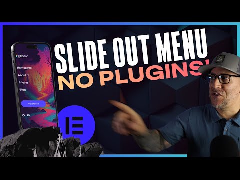
In this tutorial, I’ll take you step by step to create your slide-out mobile menu with just HTML and CSS. No plugins are required. There’s also a video at the end of this post to help follow along.
Designing a Mobile Menu
Before adding the code below, we first need to design and build our mobile menus. Start by creating a Section Template. This is going to be your menu.
Make your menu full width and full height, and style it up as you like. I do go more into this in my video tutorial so make sure to check that out.
I like to add either the Nav Menu widget or the Icons List widget in my mobile menus, and I suggest sticking with those. For better SEO results and if your menu has drop-down sub-items, then it’s best to use the Nav Menu width.
Once your template is completed, you’re good to go to the next step.
Building Custom Slide Out Menu for Elementor Without a Plugin
Step 1: Adding the HTML
In the header, add an HTML widget and make sure it’s aligned to the left.
There are 2 different HTML snippets below. One is for using the Nav Menu widget in your mobile menu template. The other is for using the Icons List widget in your Mobile Menu Template. These are are to make sure you’re making your mobile menu SEO friendly.
HTML for Nav Menu Widgets
<!- for using the Nav Menu widget in the mobile menu ->
<input type="checkbox" id="nav-control" class="lytbox-nav_control">
<label for="nav-control" class="lytbox-button">
    <div class="hamburguer">
        <span></span>
        <span></span>
        <span></span>
    </div>
</label>


<div class="lytbox-navigation">

[elementor-template id="118"]

</div>
HTML for Icon List Widgets
<!- for using the Icon List widget in the mobile menu ->
<input type="checkbox" id="nav-control" class="lytbox-nav_control">
<label for="nav-control" class="lytbox-button">
    <div class="hamburguer">
        <span></span>
        <span></span>
        <span></span>
    </div>
</label>


<nav class="lytbox-navigation">

[elementor-template id="118"]

</nav>
Step 2: Editing the HTML
The only thing that needs to be edited in your HTML is the Elementor Template ID shortcode.
Find the shortcake to you section template and replace the shortcode with it in the HTML snippet.
Step 3: Add the CSS
Copy and paste the CSS snippet below:
/* edit the hamburger and close icon colors here */

.lytbox-button {
	--hamburger-color: #000;
	--close-x-color: #fff;
	display: block;
	height: 18px;
	cursor: pointer;
	position: relative;
	z-index: 101;
}


/* must add in elementor template ID number to make the menu full width */
.elementor-265 {
	width: 100%;
}


/* end editing */

.lytbox-navigation {
	position: fixed;
	top: 0;
	left: 0;
	transform: translateX(100%);
	overflow: hidden;
	transition: transform 0.2s;
	width: 100%;
	height: 100vh;
	z-index: 100;
}

.lytbox-navigation {
	display: flex;
	justify-content: center;
	align-items: center;
}


/* toggle hamburger*/

.lytbox-button .hamburguer {
	position: relative;
}

.lytbox-button .hamburguer span{
	display: block;
	height: 2px;
	width: 24px;
	background: var(--hamburger-color);
	transform-origin: 50% 50%;
	transition: all 0.1s 0.2s ease, transform 0.2s ease;
}

.lytbox-button .hamburguer span:nth-child(2) {
	transform: translate(0, 6px);
}

.lytbox-button .hamburguer span:nth-child(3) {
	transform: translate(0, 12px);

}

.lytbox-nav_control {
	position: absolute;
	left: -9999px;
	width: 100%;
	clip: rect(0, 0, 0, 0);
}

.lytbox-nav_control:checked~.lytbox-navigation {
	transform: translateX(0);
	opacity: 1;
	transition: transform 0.3s, opacity 0.3s;
}

.lytbox-nav_control:checked~.lytbox-button .hamburguer {
	transition: all 0.1s 0s ease;
}


/* closed X */

.lytbox-nav_control:checked~.lytbox-button .hamburguer span {
	background: var(--close-x-color);
	transition: all 0.1s ease, transform 0.1s 0.2s ease;
}

.lytbox-nav_control:checked~.lytbox-button .hamburguer span:first-child {
	opacity: 0;
}

.lytbox-nav_control:checked~.lytbox-button  .hamburguer span:nth-child(2) {
	transform: translate(0, 6px) rotate(45deg);
}

.lytbox-nav_control:checked~.lytbox-button .hamburguer span:nth-child(3) {
	transform: translate(0, 4px) rotate(-45deg);

}
At the top of the CSS snippet, there are 3 areas to edit.
- The Hamburger color – replace the color code with your own menu icon color
- The Close X color – replace the color code with the color you’d like for your close button
- The Elementor ID number (elementor-265) – replace with the number in your template shortcode. This is to make sure your slide-out menu is full-width.
Step 4: Adjust Your Header
You’ll need to make all the usual adjustments, such as hiding your desktop header and fixing the spacing around your HTML widget.
Using an Off Canvas Widget in an Elementor Addon
If, for some reason, this method is not working for you, it could be due to the theme’s code. I’ve built this with Hello Theme, other themes may require adjusting the CSS.
And if you’re not comfortable with HTML and CSS, the next option I would suggest is going with an Off-Canvas widget. Here are my recommended Elementor add-ons that have the Off Canvas:
If you’d like to follow along, check out the video I made here. I go more into detail, and we look at how to design and dope mobile menu.


