In this tutorial, you’ll learn how to make anchor links work in Elementor mobile menus built with pop-ups. This works with Elementor’s default WordPress Menu widget, Icon List widget, and the Button widget and only requires Elementor Pro. No additional plugins are needed.
Elementor’s popups are a solid solution for making mobile menus look and feel more modern. But the problem is, that anchor links don’t work in them. By default, if you add an anchor link in Elementor’s popup menu, when clicked on, the page scrolls to the section but doesn’t close automatically, and when the user closes it scrolls back to the top.
This has been a super big pain for most of us! But now, we have a solution. And all it takes is copying a code snippet and adding a class. I’ll walk you through these steps.
First, What is an Anchor Link?
Just to make sure we’re on the same page and you understand how this tutorial works, let’s get clarity on what an anchor link is.
An anchor link is a link when clicked on, the web page scrolls to a set position. This is super useful on single-page websites with a menu that scrolls different sections of the web page.
It’s not complicated setting up a menu in Elementor for a single-page website. If you want to learn how to build a menu like this, I’ve added a link to the article at the end of this post. Here’s an anchor link to help you get there.
1st Step: Build Your Menu and Sliding Popup Menu
If you haven’t built your menus yet, here’s a tutorial to guide you in using Elementor Popups for building slide-out mobile menus. Also, the video tutorial at the end of this post goes into the full process of building a desktop and sliding out popup menus.
Once you’ve got your slide-out menu ready, you’re good to go on the next steps.
2nd Step: Adding Code Snippet
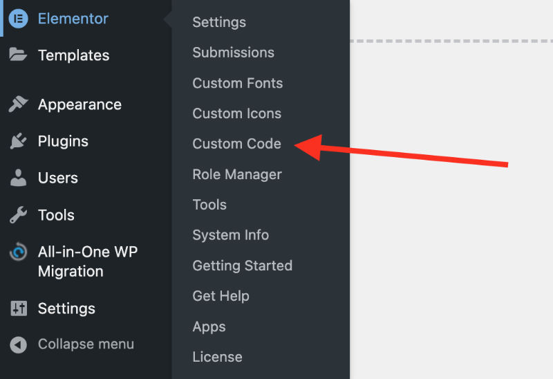
In your WordPress Dashboard, navigate to Elementor Custom Code.
Add a new code snippet. Set it to “</body> – End” and check the “Always load jQuery” box.
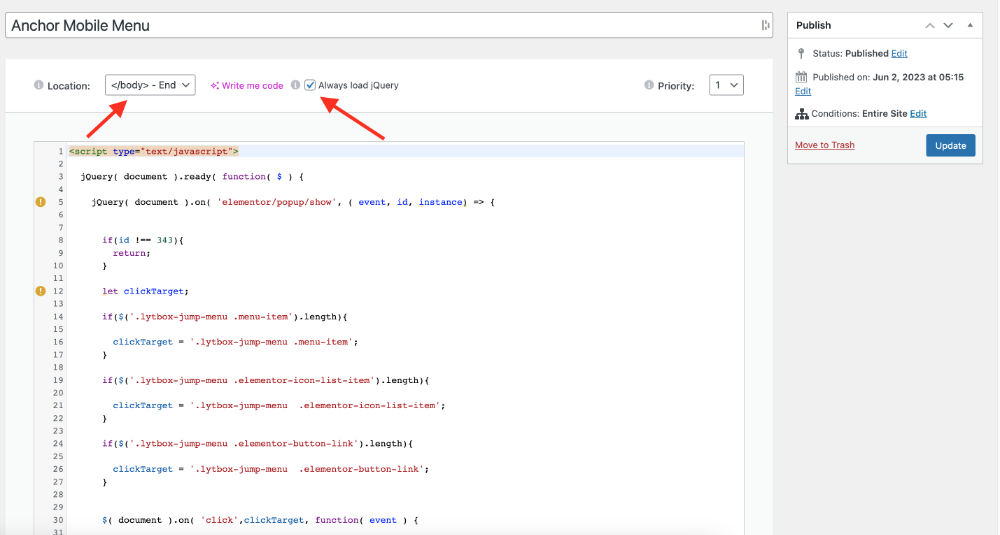
Next, copy and paste this code snippet and save. In most cases, you’ll set the conditions to the entire site. But if your slide-out menu is only on specific pages, then you’ll need to adjust your code conditions.
<script type="text/javascript">

	jQuery( document ).ready( function( $ ) {

		jQuery( document ).on( 'elementor/popup/show', ( event, id, instance) => {


			if(id !== 343){
				return;
			}

			let clickTarget;

			if($('.lytbox-jump-menu .menu-item').length){

				clickTarget = '.lytbox-jump-menu .menu-item';
			}

			if($('.lytbox-jump-menu .elementor-icon-list-item').length){

				clickTarget = '.lytbox-jump-menu  .elementor-icon-list-item';
			}

			if($('.lytbox-jump-menu .elementor-button-link').length){

				clickTarget = '.lytbox-jump-menu  .elementor-button-link';
			}


			$( document ).on( 'click',clickTarget, function( event ) {


				elementorProFrontend.modules.popup.closePopup( {id: id}, event )

			});

		} );

	});


</script>
3rd Step: Editing the Code Snippet
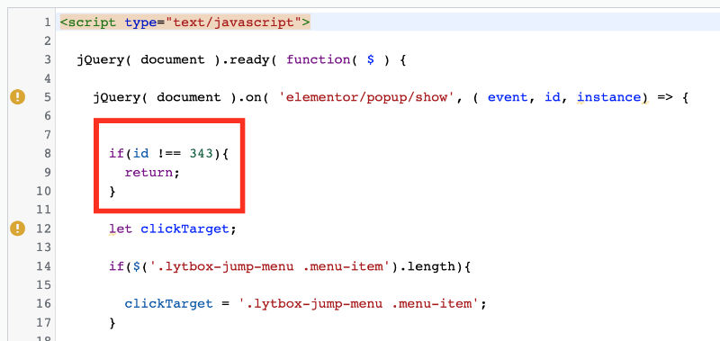
In line 8 of the code snippet, you’ll see “if(id !== 343)”. This is the only place you’ll need to edit the code.
Go to your Elementor Popup that you’re using for your slide-out menu and locate the Shortcode. You should see a 3-4 digit ID in your shortcode that looks like this – [elementor-template id=”343”].

Copy the ID numbers and go back to the code snippet. Where it says “if(id !== 343)”, you’re going to replace the 343 with your shortcode ID number. Now this is very important, make sure to only replace the numbers and do not remove the space between == 343.
4th Step: Adding a CSS Class
This code snippet works for popup slide-out menus and can be used on Elementor’s default WordPress Menu widget, Icon List widget, and Button widget. It’s important to note that only one can be used at a time in your menu.
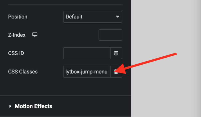
Go to the widget you are using for your menu in your popup, navigate to the advanced tab, and paste in this class – ‘lytbox-jump-menu’.
Tutorial Wrap Up
And that’s it! If everything was followed correctly, anchor links in your popup mobile menu should auto-close.
If you have questions, use the comments below. And if you’re more of a visual learner and want to take a deeper dive into the menu and popup-building process, here’s a more in-depth video tutorial.
Thanks for reading and stay creative!
If you want to build a mobile menu using Elementor Popup, read this article: https://lytboxacademy.com/create-better-mobile-menus-with-elementor-popups/

