Skewmorphic Buttons and Cards for Elementor
In this tutorial, we’ll explore how to create skewmorphic buttons and cards using Elementor. Skewmorphism is a design style that mimics real-world textures and appearances, giving your web elements a more tactile and familiar feel. By the end of this tut, you’ll be turning your plain and flat elements into more creative and life-like styles.


What Is Skeuomorphism?
Skeuomorphism is a design approach that incorporates elements resembling their real-world counterparts. This style uses shadows, gradients, and textures to create a sense of depth and realism. It’s a way to make digital interfaces feel more real and better stand out.
What Will We Need For This Tutorial?
You’ll need Elementor Pro, which you can get here. Additionally, we’ll use Figma’s free version to help us out. If you prefer, alternatives like Photoshop, Illustrator, or Affinity Photo can also be used. Let’s get started on creating some cool skewmorphic elements!

A Simple 3-Step Process To Create A Skeumorphic Effect
We’ll start simple with a 3-step process. First, we’ll add a gradient background to our element. Then we’ll add a box shadow. And for the 3rd step, we’ll add 2 inner shadows to our element. This is an easy way to begin but when your design skills start to level up, you can do a whole lot more by adding in several box shadows and inner shadows. It’s only the beginning and I hope to see you get more creative with this!
Step 1: Apply a gradient background to your element
Give your element (bottom or card) a gradient background. Start by selecting the same color for both gradient colors and keep them going from top to bottom or 180 degrees.
Next, use the color picker in Elementor or Figma (depending on how you are setting up your colors) and slide the bottom color to a lighter hue. Keep in the same spectrum and only make the color slightly lighter.
Next, do the same for your top color but for the top, make it slightly darker with your color picker. Your background should look like the original color but with a slight gradient like the example below.
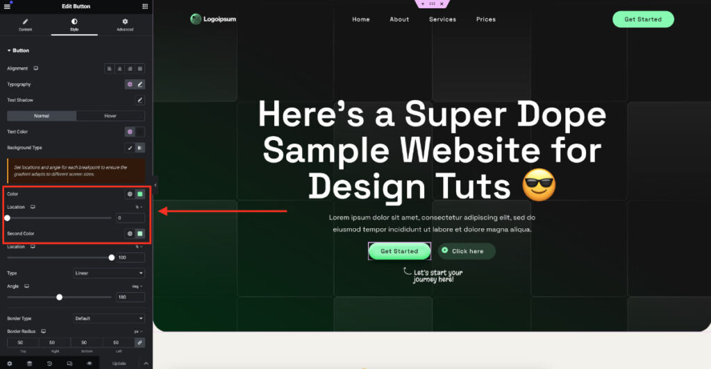
Step 2: Apply a box-shadow
You’ll need to give a box shadow to your element. Use a color picker to choose a darker color of the element’s main color then add a blur from 20-40px and an opacity of 15-40%. This will all depend on the color of your element and the background color of your website.
My average box-shadow value looks like this – 0px 12px 40px #color for my cards and 0px 8px 20px #color for my buttons. Start with these and adjust the values for your design.
Step 3: Apply 2 inner shadows to your element
This step is where we get the skeuomorphic effect. We’ll need to apply a light inner box shadow over the dark side of the gradient, and a dark inner box shadow over the light side of the gradient.
This is where the color picker really comes in handy. I suggest finding the right colors for your shadows in a tool like Figma or something similar before adding this to Elementor.
For the top inner shadow: Use your color picker in the middle of your element, then drag it to the left until it is considerably lighter than the top. Don’t go too white, but still be generous. The more light you make it, the more the effect will pop.
Next, give values to the first inner shadow. They look like this: 0px 12px 30px #color for cards and 0px 8px 20px for buttons. Adjust as you see fit based on your colors and designs.
For the bottom inner shadow: Do the same with the color picker but slide to the right and downward until it’s darker than the bottom of your element.
Again, set the values to the inner shadows. They look like this: 0px -12px 30px #color for cards and 0px -8px 20px for buttons. Adjust as you see fit based on your colors and designs.
CSS Snippets For Elementor
In Elementor, we can set the gradient background using Elementor. That’s super easy. But we will need to add a CSS snippet for the box shadow and the inner shadows. Technically, we can add box shadows using the Elementor editor, but for this effect, we can not because it conflicts with the inner shadows and cancels them out.
We’ll add the snippets below and edit the colors and shadow sizes to fit our designs.
In your button, icon box widget, or inner container, go to the Advanced tab and down to Custom CSS. This is where we will add our CSS. It’s best to add the CSS here because we can see the changes as we make them when adjusting our colors and shadow sizes.
If you are experienced with CSS, you can create a class and add them to your stylesheet later. But start in the Elementor editor to make it easier.
CSS Snippet for the Button widget
selector a {
box-shadow: 0px 12px 40px /*color here*/, inset 0px 8px 12px /*color here*/, inset 0px -8px 12px /*color here*/;
}
CSS for the Icon Box widget
selector .elementor-widget-container {
box-shadow: 0px 12px 40px /*color here*/, inset 0px 8px 12px /*color here*/, inset 0px -8px 12px /*color here*/;
}
CSS for Inner Containers that can be used as cards
selector {
box-shadow: 0px 12px 40px /*color here*/, inset 0px 12px 30px /*color here*/, inset 0px -12px 30px /*color here*/;
}
How to edit the CSS snippets
Use your color picker in Figma or a similar tool to find the color values for your shadows and replace /*color here*/ with the hex codes or rgba().
Adjust the box-shadow sizes by adjusting the values by the px. Make sure to keep all the spacing the same. If the CSS is not applying the effects for you, double check the spacing is exactly as in the example CSS snippets below:
Example with solid HEX and RGBA color codes:
selector a {
box-shadow: 0px 12px 40px rgba(16, 91, 44, .2), inset 0px 8px 12px #B3FFD0, inset 0px -8px 12px #2EFF7D;
}
Video Tutorial On Skewmorphic Buttons & Cards with Elementor
For those of you who like things visual, check out my video tut! And don’t forget to subscribe when you’re checking it out (if you find it provides value).
If you like to get more creative with your Elementor sites, check out more creative styles for your cards.


