Hide Header on Scroll Down, Show On Scroll Up With Elementor
In this tutorial, we will create a sticky header with Elementor that hides when scrolling down and reappears when scrolling back up.
What You Will Need for This Tutorial
First, this is super easy if you follow along step by step. Even though we will be using Javascript and CSS, you don’t really need to know how to code. All you need to do is copy and paste what I show you. And if you get stuck, there’s a video tutorial at the bottom of this post.
Now, we will need Elementor Pro to do this. In all reality, we need Elementor Pro to do anything, really. The free version is just not enough and should be used to test El. Suppose you want to unlock the real power of Elementor and save yourself countless hours trying to find workarounds that end in headaches. In that case, you gotta get the Pro version.
Okay, let’s have some fun and dive into Elementor!
How To Hide Elementor Sticky Header On Scroll
This effect hides your Elementor header and menu when the user scrolls down. This helps to remove distractions for the website user. It’s helpful when you want the user to focus on the website’s content and funnel, guiding the user on a better user experience.
And then, when the user scrolls up, the header and menu reappear. This way, the user doesn’t have to scroll to the top of the website and can easily navigate. All of this is aimed at improving the website’s UI.
We make this work by adding a bit of Javascript that pulls the header up to the top and out of the screen’s view. And when we scroll down, the JS pulls the header back down. It’s actually quite simple, and the method I’m going to show you is probably the easiest way of doing this.
Step 1: Make a Header With Elementor
Make your header just as you usually would. The important thing here is to keep your header in only one section or container. And if you want your mobile menu to have the same effect, you would also need to keep your mobile in the same section.
If you do not want your mobile to have this effect, then create your mobile menu in its own section and use Responsive Conditions to hide the mobile section on the desktop.
Step 2: Make Your Elementor Header Sticky
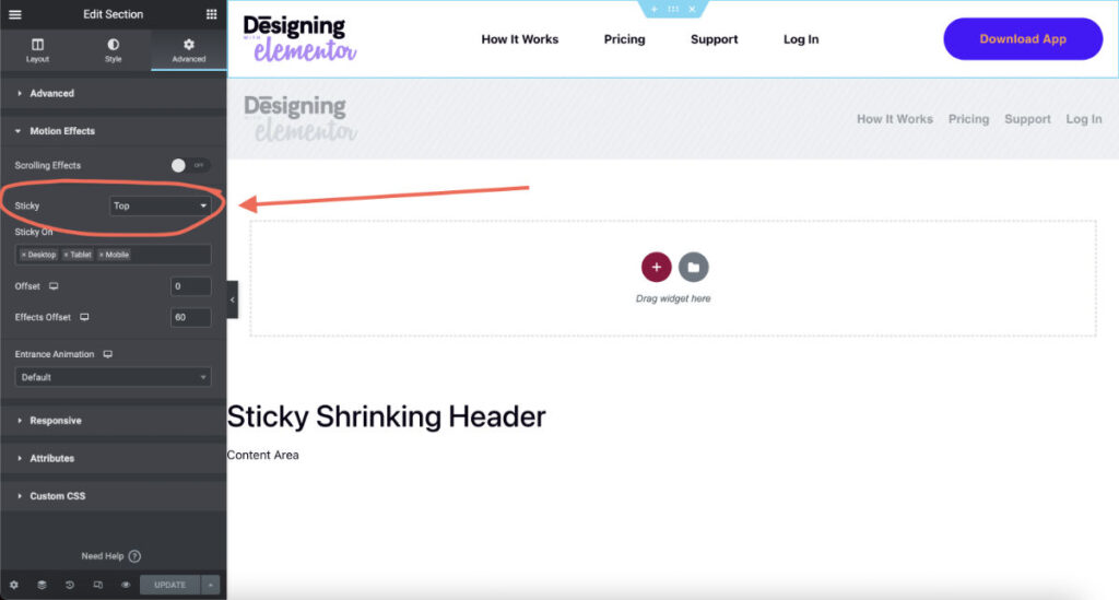
We have to make our headers sticky. Navigate to the section’s advance tab and select Motion Effects. In the Sticky option, turn it to’ Top.’
To learn more about Sticky Headers and how to set them up to add effects, you can check out this tutorial here.
Step 3: Add CSS ID to Your Header Section
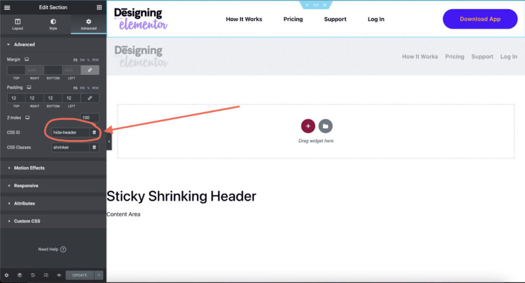
In your header’s section, go to the Advanced Tab and under the advance section, add hide-header to your CSS ID. And that is all that needs to be done to your header.
Step 4: Copy & Paste Javascript
In the next step, we need to copy and paste this snippet of Javascript. What is important is adding this in the correct location. We are going to add Javascript using Elementor Code.
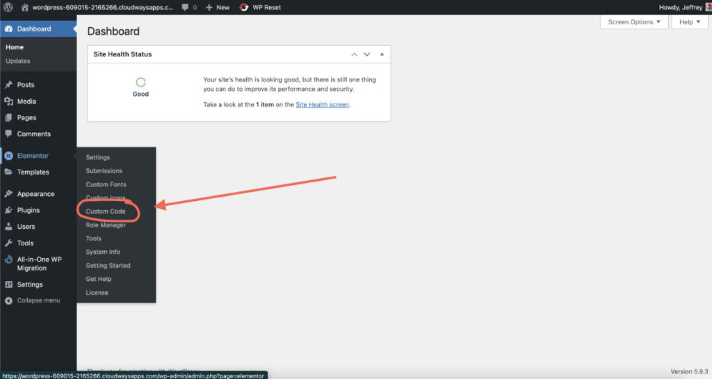
Navigate to ‘Elementor Code’ in your dashboard under the Elementor options in the left-side menu.
Select Add New and set the location to – End. This will add the Javascript snippet to the footer of every page. This is ideal as it won’t affect your website’s load time and speed.
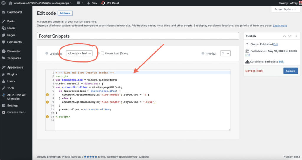
Step 5: Adjust the Javascript and CSS
There are only two parts you will need to adjust to make it work right for your website.
The Javascript:
<!-- Hide and Show Desktop Header -->
<script>
var prevScrollpos = window.pageYOffset;
window.onscroll = function() {
var currentScrollPos = window.pageYOffset;
  if (prevScrollpos > currentScrollPos) {
    document.getElementById("hide-header").style.top = "0";
  } else {
    document.getElementById("hide-header").style.top = "-80px"; /* adjust this value to the height of your header */
  }
  prevScrollpos = currentScrollPos;
}
</script>
Where you see .style.top = “-80px”; In this part, you would only need to adjust the 80px to match the height of your header. If part of your header still shows when you’re scrolling down, then make the value higher until your header is entirely off-screen.
The CSS:
<style>
/* Show Hide Sticky Header Speed Control */
#hide-header {
	transition: all .4s ease!important;
}
</style>
Where you see transition: all .4s ease!important; this controls the speed of the header going up and down. The .4s is .4 seconds. So, for example, if you set this to 1s, then it will take a full second to go up and down. You can adjust this to have the correct animation speed for your header.
Combining Elementor Sticky Effects To Your Hiding Menu & Header
With Elementor Sticky headers, we can do all kinds of effects. I have done my fair share of experimenting and combining effects. This technique is excellent for mixing and merging with others.
For example, I combined a fully shrinking sticky header with the hiding header in the video tutorial. It came out with a clean result. If you want to learn more about sticky header effects, check out my YouTube chancel and have fun!
Hide Header on Scroll Down, Show On Scroll Up With Elementor Video Tutorial
Here is a video tutorial for those who prefer a quick visual lesson! If you have questions, drop them in the comments. Cheers!

