Recently Elementor released Grid Containers, which uses the concept of CSS grids and makes the process of creating layouts very easy. It is also better for performance as it reduces the nesting of elements thus decreases the DOM size.
What are Elementor Grids?
Elementor Grid Containers is a feature of Elementor that allows creating sections which organize elements in a grid layout. When we create layouts that require using inner containers, we have to nest containers inside containers, which comes with its set of issues (additional padding, alignment issues, reduced performance).
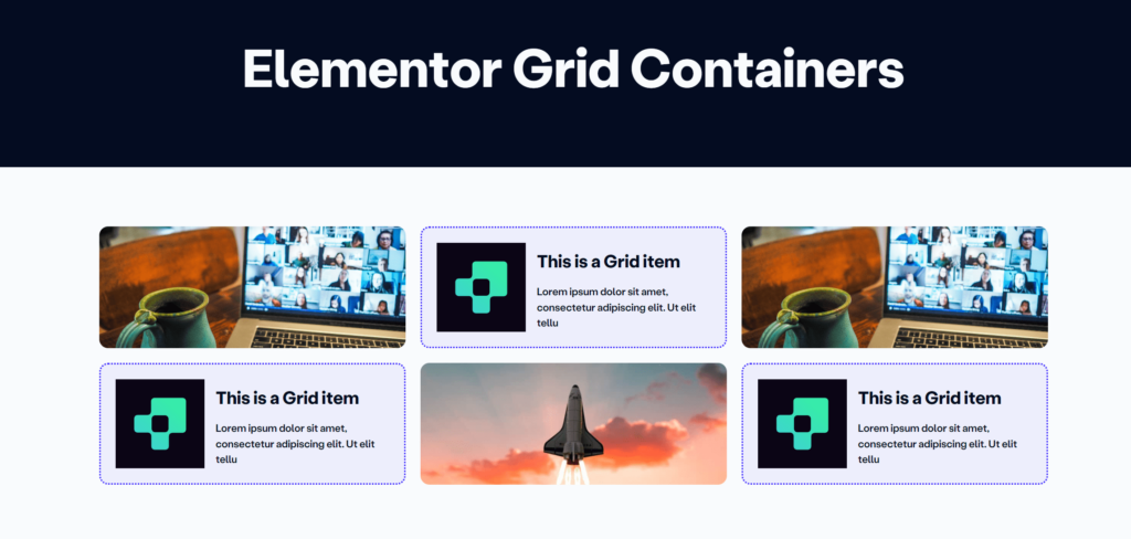
However with Grid Containers, we can directly put elements inside and align them as we see fit. Here is an example below, where the layout has 3 images and 3 icon boxes, in alternate positions:
Why use a Grid Container?
Elementor Grid Containers let you easily make neat and tidy layouts with rows and columns. They save time by removing the need for many containers and complex settings, keeping everything lined up and looking good.
While using Flexbox, we will need additional containers to create the layout, and also set up the width of each container to make them align properly. We would also need to add additional containers for each row of elements that we need.
How to activate Elementor Grid Containers?
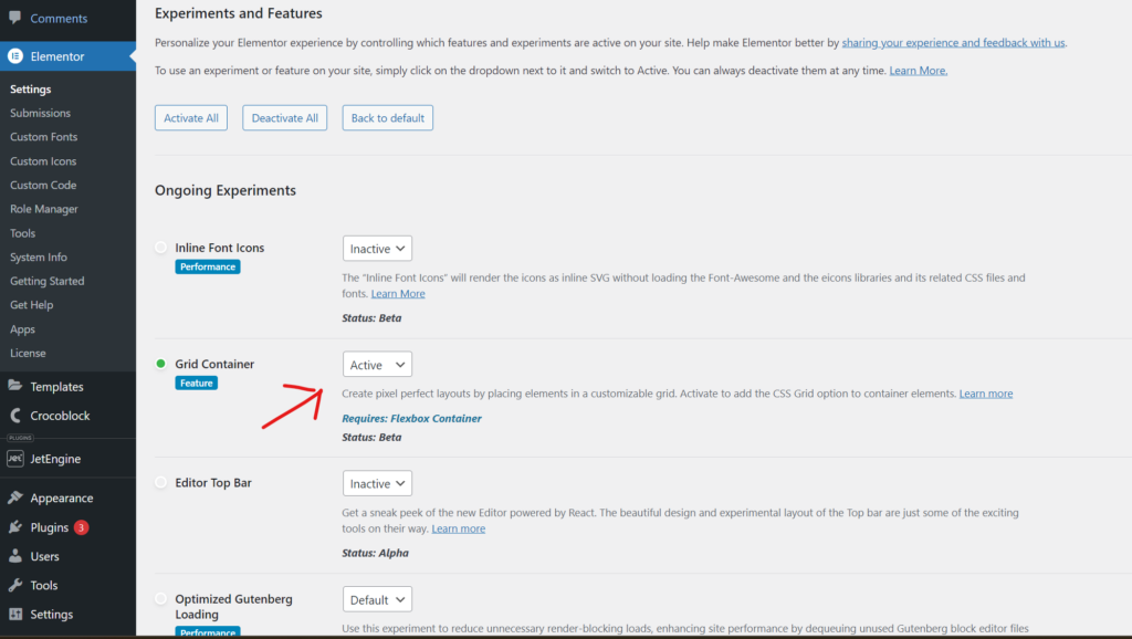
Note: We do not recommend using a feature, that is in Beta mode, on a client website.
To activate Grid Containers, go to Elementor Settings > Features and turn the Grid Container setting to active.
How to use Elementor Grids to create layouts?

Once you have activated Elementor Grids Container, open your Elementor editor and click on Add New Container. Now you can find the Grid option along with Flexbox.
Go ahead and add your elements (you do not need to add a container to add any element). Let’s have a look at the Grid settings now:
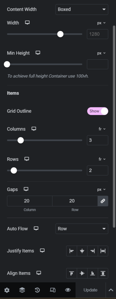
- We have the content height and width similar to Flexbox. These settings control the overall width and height of the Grid
- Grid Outline creates an outline of all the cells
- We can set the number of rows and columns by specifying a number in the “fr” setting, where fr stands for fractional unit. Fractional unit defines the a fraction of the total space (width in case of column and height in case of row). So if we set one grid item to 2 fr and two other items to 1 fr, the the first item will be twice in size compared to the other two items
- Gap is the gutter between cells
- Auto Flow has two settings: Row and Column. It decides which directions items will be added. If it’s set to Row then the items will fill up the row then move to the next column, and vice versa.
- Justify and Align items settings are for the alignment in respective axes.
This was just the basics of Elementor Grids. We can create so more complex layouts using Elementor Grid Containers. Here is an article about creating more complex layouts using some simple CSS: https://lytboxacademy.com/complex-grid-layouts-using-elementor-grid-containers/
For a detailed walkthrough, here is a video:

